Websites - Piranha Killer Ramen
An Izakaya Experience From Table to Takeout
Piranha Killer Ramen, a standalone Japanese izakaya, needed to establish their first professional web presence to drive online orders, reservations, and gift card sales. Working within Toast POS's rigid builder constraints, I designed a multi-page restaurant website that seamlessly integrates with their existing POS system while reflecting their bold brand identity. The result is a high-converting digital storefront that serves both discovery-phase diners and repeat customers seeking quick online ordering.

 Toast POS Website Builder
 Canva
Canva Google Search Console
 Google Business Profile
Business Context
Piranha Killer Ramen is a Japanese Izakaya-style restaurant offering authentic ramen and small plates in a vibrant, community-focused atmosphere. Prior to this project, the business operated without a proper digital presence, relying on a basic landing page hosted on a free platform cluttered with third-party advertisements. The goal was to establish credibility, improve discoverability, and create a seamless path from awareness to action, whether that meant booking a table, placing an order, or purchasing a gift card.
Brand Problems Identified
- No professional online presence: existing landing page undermined brand credibility with intrusive ads and limited functionality
- Missed revenue opportunities from online ordering, reservations, and gift card sales due to lack of integrated e-commerce capabilities
- Poor discoverability and SEO performance, making it difficult for new customers to find the restaurant through search
- Inconsistent brand representation across digital touchpoints, with no cohesive visual identity or messaging strategy
- No connection between web presence and POS system, requiring manual order and reservation management

Design Goals
- Establish a credible, branded digital presence that reflects the restaurant's authentic Japanese Izakaya experience and builds trust with potential diners
- Enable direct revenue generation through integrated online ordering, reservation booking, and gift card sales
- Improve search visibility and local discoverability through strategic SEO implementation and Google Business Profile optimization
- Create a seamless, mobile-first user experience that reduces friction from discovery to conversion across all key customer journeys
- Ensure operational efficiency by integrating the website directly with Toast POS for real-time menu updates, order management, and reservation handling

Market Context
The restaurant industry has undergone a significant digital transformation, accelerated by shifts in consumer behavior toward online research, ordering, and reservation booking. For independent restaurants competing with large chains and delivery platforms, a strong web presence is no longer optional, it's a competitive necessity. In this landscape, a professional website serves as both a digital storefront and a trust signal, directly influencing customer acquisition and retention.
Target Audiences
Local Foodies & Regulars
Community members seeking authentic Japanese cuisine who value quality, convenience, and a memorable dining atmosphere
First-Time Diners & Explorers
Curious eaters researching the restaurant online, seeking menu details, ambiance previews, and easy booking options
Remote Orderers & Gift Buyers
Customers looking for convenient takeout, delivery, or gift card purchases without the friction of third-party apps
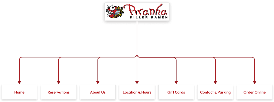
Information Architecture
The information architecture was designed to balance business priorities with user intent. I structured the site to prioritize action-oriented pages (Menu, Order Online, Reservations) while ensuring brand storytelling (About) and practical logistics (Contact & Parking) remained accessible. The navigation was intentionally flat to reduce cognitive load, with Toast's default transactional pages (Menu, Gift Cards, Online Ordering) integrated seamlessly alongside custom brand pages. This hybrid structure allowed the client to leverage Toast POS's backend efficiency while maintaining full creative control over the brand experience.
UX Structure & Planning
The UX structure was built around three core user journeys: discovery (learn about the restaurant), dine-in conversion (make a reservation), and takeout conversion (place an online order). The homepage serves as a hub, immediately surfacing the restaurant's unique value proposition and guiding users toward their primary intent. Given Toast's rigid layout system, I focused on content sequencing and visual rhythm to guide attention, rather than relying on custom interaction patterns. Each page was structured to answer user questions in descending order of importance: What is this place? What can I eat? How do I get it? Where are you located?
Content Hierarchy
- Primary CTAs (Order Online, Reservations) placed above the fold and reinforced throughout the experience to capture high-intent users immediately
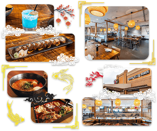
- Brand storytelling and atmosphere showcased through interior imagery and About page narrative to build emotional connection and differentiation
- Menu access prioritized in global navigation with direct integration to Toast POS, ensuring menu accuracy and reducing client maintenance burden
- Gift Cards surfaced as a passive revenue stream in navigation, leveraging Toast's e-commerce integration without requiring custom development
Design Decision
- One critical UX decision was treating Toast's platform constraints as a content design challenge rather than a limitation. Instead of fighting the builder's predefined section layouts, I leaned into modular content blocks and used typography, color, and imagery to create visual hierarchy and brand personality. This approach reduced development friction, accelerated delivery, and ensured the site remained maintainable for the client long-term. The tradeoff was accepting less layout flexibility, but the business benefit—faster time-to-market and Toast POS integration—far outweighed the creative compromise.
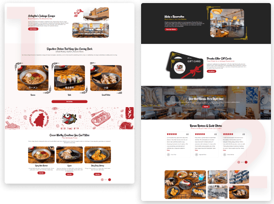
Visual Design & UI System
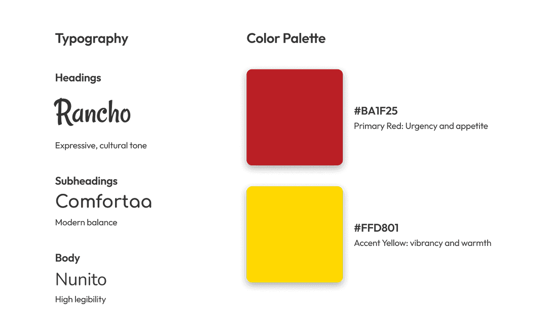
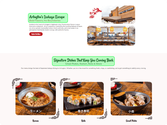
The visual identity needed to reflect the boldness of Japanese izakaya culture while remaining inviting to a diverse local audience. With a vibrant brand palette anchored in red and yellow, the design system emphasized contrast, warmth, and clarity across all touchpoints. Typography played a supporting role: expressive headings communicated personality, while clean body text ensured readability across devices. Given Toast's rigid layout constraints, visual customization became strategic, using color blocking, spacing rhythm, and branded graphic accents to create distinction without relying on flexible layout systems. The result is a cohesive, high-energy aesthetic that feels authentically tied to the physical restaurant experience.
Website Build & Implementation
Toast's Website Builder was selected as the optimal platform for this project due to its native integration with the client's existing Toast POS system. This eliminated the need for third-party plugins or custom API connections, ensuring real-time synchronization between online orders, gift card sales, and the restaurant's operations. The platform's managed infrastructure also removed the burden of hosting, security patches, and uptime monitoring from the client. While the builder's layout system is more structured than custom-coded solutions, this constraint actually accelerated delivery and reduced long-term maintenance costs, allowing the client to focus on running their restaurant rather than managing web infrastructure.
Assets & Integration
- The client had very little in terms of visual assets. However, they provided high-resolution photography and videos of the restaurant's interior, menu items, and their logos. The logo and color palette provided the foundation for the entire visual system. Custom graphical embellishments such as decorative dividers, icon treatments, and branded section headers, were layered into the predefined layouts to inject visual personality and brand consistency without requiring custom code.
Performance & SEO
- SEO optimization was approached through a combination of on-page tactics within the builder and external validation tools. Page titles, meta descriptions, header tags, and alt text were configured for each page using Toast's built-in SEO controls. The site was submitted to Google Search Console for indexing and monitored for crawl errors or mobile usability issues. The client's Google Business Profile was updated with the new website URL to strengthen local SEO signals. Performance considerations included image compression prior to upload, minimal use of heavy scripts, and reliance on Toast's CDN for fast asset delivery.
Accessibility Considerations
- Ensured semantic HTML structure and ARIA labels were properly implemented within Toast's platform constraints to support screen reader navigation across all custom and default pages
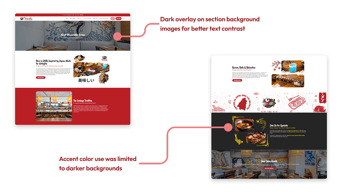
- Verified minimum 4.5:1 color contrast ratios between text and backgrounds using the brand palette. The Accent color was strictly used with dark backgrounds.
- For Text on images, dark backgrounds were used on the images to ensure better contrast.
Pre-Launch Checks
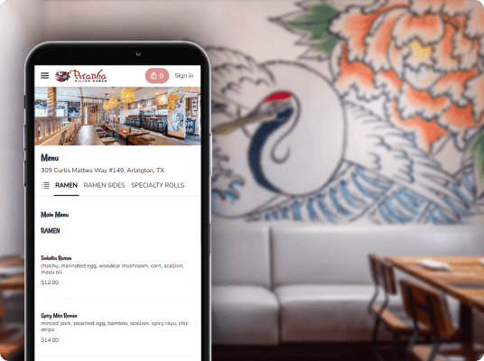
- Conducted cross-browser and cross-device testing on iOS, Android, Chrome, Safari, and Firefox to validate responsive behavior and Toast POS integration functionality
- Implemented comprehensive on-page SEO including meta titles, descriptions, alt text for restaurant imagery, and schema markup; submitted sitemap to Google Search Console and synced with Google Business Profile
- Performed final QA walkthrough with client across all user journeys (reservations, online ordering, gift card purchases) to validate business requirements and content accuracy before go-live
Outcome & Impact
The Piranha Killer Ramen website successfully established a cohesive digital presence that aligned with the restaurant's vibrant brand identity while meeting critical business objectives. By leveraging Toast's integrated platform, we created a streamlined experience that connects discovery, menu browsing, reservations, and online ordering in one unified journey. The site now serves as both a marketing asset and a revenue driver, with direct paths to gift card purchases and takeout orders while maintaining the authentic, energetic personality of the brand.
How the Website Supports Business Goals
1
Established credible online presence replacing ad-heavy landing page, improving brand perception and customer trust
2
Enabled direct revenue channels through integrated online ordering and gift card sales via Toast POS
3
Improved discoverability through proper SEO implementation and Google Business Profile integration
Key Takeaway
This project reinforced the value of platform-specific design thinking. Rather than fighting Toast's structural constraints, we leaned into its strengths(POS integration, mobile optimization, and operational reliability) while using visual customization to inject personality. The result is a website that feels custom-built while maintaining the technical advantages of a specialized restaurant platform. Close client collaboration through multiple revision cycles ensured the final product honored their specific vision while still serving user needs effectively.

What Worked Well
- Strategic use of brand-derived color palette and expressive typography created visual distinction within Toast's layout constraints
- Tight integration between custom pages and Toast's default functionality created seamless user journeys from discovery to transaction
- Iterative client collaboration process ensured final delivery matched restaurant's operational needs and brand personality