Websites - Dunbar Ross International
Building Digital Credibility for a Global Consultancy
Dunbar Ross International, an established international business consultancy, had built their reputation through referrals but lacked online visibility to consolidate their expertise. I designed and developed a strategic single-page website that positions their consultancy services with clarity and professionalism, establishing their digital presence while maintaining the credibility they'd earned offline.

 WordPress
 Photoshop
Business Context
Dunbar Ross International is an established international business consultancy that built its client base primarily through referrals and relationships. While this organic growth model served them well, the leadership team recognized a critical gap: the absence of a professional digital presence meant they were invisible to prospective clients conducting online research. Without a website, the firm lacked credibility signals expected of a serious consultancy, and they were missing opportunities to showcase their expertise to companies actively searching for international business guidance. The need wasn't to generate leads cold, it was to validate credibility when warm introductions happened, and to ensure discoverability for companies entering new markets who were vetting potential partners.
Brand Problems Identified
- No digital presence to support referral-based business development or validate expertise during prospect research
- Inability to communicate service breadth and international capabilities to companies unfamiliar with the firm
- Lack of a centralized resource to articulate value proposition and differentiate from competing consultancies
- Missing baseline credibility marker expected by corporate decision-makers evaluating consultancy partners

Design Goals
- Establish immediate professional credibility through polished, corporate-appropriate design language
- Clearly communicate service offerings and international expertise in a scannable, digestible format
- Create a low-maintenance digital asset that supports relationship-driven business development
- Build a foundation for discoverability through search while maintaining focus on credibility over conversion volume
- Design for future content expansion as the firm's service portfolio evolves

Market Context
The international business consultancy space is crowded with firms ranging from global giants to boutique specialists. Prospective clients typically discover consultancies through three channels: referrals, industry events, and online search during active vendor evaluation. For a referral-based firm like Dunbar Ross, the website doesn't need to win competitive RFPs cold, it needs to reinforce trust during the consideration phase. The competitive bar isn't differentiation through flashy features it's meeting the expected standard of a credible consultancy while communicating specialized value clearly. In this context, a single-page corporate site that emphasizes clarity, professionalism, and service breadth over aggressive lead generation made strategic sense.
Target Audiences
Mid-Market & Enterprise Companies
Organizations expanding internationally who need expert guidance navigating cross-border complexities and market entry strategies.
Corporate Decision-Makers & Executives
Senior leaders evaluating consultancy partners who expect professional credibility signals and clear service articulation.
Referral Sources & Industry Partners
Professional networks and existing clients who need a shareable resource to explain Dunbar Ross's capabilities to prospects.
Information Architecture
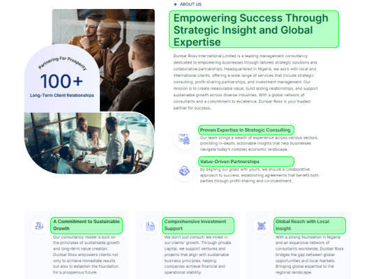
I structured the site as a single-page experience to communicate the firms full value proposition without friction. This approach eliminated navigation complexity and ensured every visitor, whether arriving from a referral or discovery, could quickly understand the company's expertise, services, and contact pathway. The IA prioritized linear storytelling: from brand credibility (About) to service offerings (Solutions) to conversion (Contact).
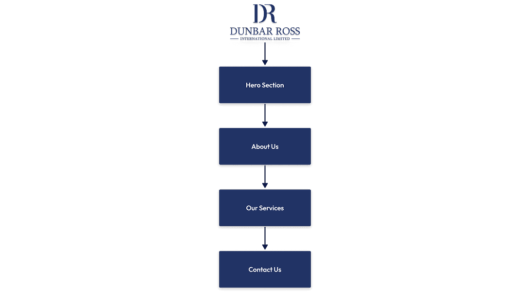
UX Structure & Planning
The UX structure was designed to minimize cognitive load while maximizing information retention. Each navigation link triggers a smooth scroll-to-section animation, creating a guided experience that feels both intentional and effortless. The tabbed layout within the Services/Solutions section was a strategic decision to surface multiple offerings without overwhelming users with vertical scrolling, allowing them to explore services at their own pace while maintaining visual focus. This structure also supported the business goal of establishing authority: visitors could engage deeply with specific services without losing context of the broader offering.
Content Hierarchy
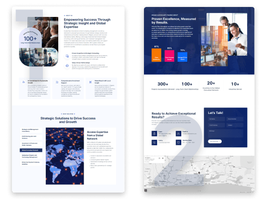
- Hero messaging establishes immediate credibility and sets expectations for the consultancy's expertise
- About section leverages company documentation to build trust and provide institutional context
- Services/Solutions tabs prioritize clarity and scannability, allowing quick comparison across offerings
- Contact form is positioned as the natural conclusion of the user journey, removing friction from inquiry
- Overall, the visual hierarchy uses scale, spacing, and brand-aligned imagery to guide attention toward high-priority content
Design Decision
- The decision to use a tabbed interface for services was driven by both UX and business strategy. It allowed the client to present complex consultancy offerings in a digestible format, reduced page length to keep users engaged, and created a modular system that could scale. Two additional services have been added post-launch without disrupting the user experience. This approach balanced comprehensiveness with usability, a critical tradeoff for a consultancy entering the digital space for the first time.
Visual Design & UI System
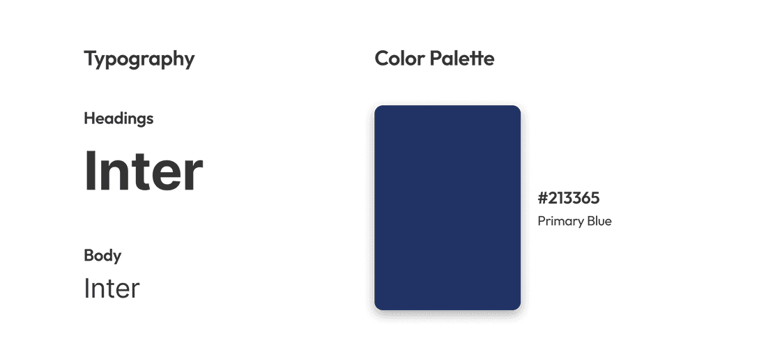
The visual design system for Dunbar Ross International was developed to communicate trust, professionalism, and global authority, essential qualities for an international business consultancy. Working from a single brand color (#213365), I built a comprehensive color system through strategic tinting and shading to create visual hierarchy and depth across the interface. The design language balances corporate sophistication with modern web standards, ensuring the brand feels established yet digitally progressive.
Website Build & Implementation
WordPress was selected as the foundational CMS for this project based on three strategic factors. First, the client needed long-term content autonomy, specifically the ability to add or modify service offerings without designer intervention. Second, the timeline constraint of three weeks required a platform with mature plugin ecosystems and reliable hosting infrastructure, allowing faster deployment without sacrificing stability. Third, the single-page architecture required smooth scroll behaviors and section anchoring, which WordPress handled natively with lightweight custom JavaScript. While more modern platforms like Framer or Webflow offer tighter design control, WordPress's maturity and the client's internal familiarity with CMS workflows made it the pragmatic choice for sustainable growth.
Assets & Integration
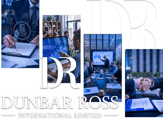
- All visual assets were custom-processed to align with brand consistency requirements. Each photograph was overlaid with a subtle tint derived from the primary brand color (#213365), creating visual cohesion across disparate stock imagery while reinforcing brand identity. The contact form was integrated using WPForms, configured with field validation, spam protection via Google reCAPTCHA, and direct email routing to the client's business inbox. The tab-based services section was built using a lightweight accordion plugin, allowing the client to duplicate and edit service entries through the WordPress backend without touching code.
Performance & SEO
- Performance optimization was critical given the corporate audience's expectation for professionalism and speed. The site was hosted on managed WordPress hosting with CDN integration. On-page SEO was structured around the client's provided company documentation: service descriptions were rewritten with keyword-rich H2 tags, meta descriptions were crafted for each core section despite the single-page structure, and schema markup was applied to highlight the consultancy's service offerings and contact information.
Accessibility
- Ensured WCAG 2.1 AA compliance with sufficient color contrast ratios across all UI elements, particularly the #213365 primary brand color against white backgrounds and tinted variations against body text
- Implemented semantic HTML structure with proper heading hierarchy (H1–H4) and ARIA labels for the tab-based services navigation, enabling screen reader users to navigate between solutions without confusion
- Tested keyboard navigation flow across the single-page layout, ensuring all interactive elements (nav links, tabs, form inputs) are accessible via Tab and Enter keys with visible focus states
Pre-Launch Checks
- Conducted cross-browser and cross-device QA testing on Chrome, Safari, Firefox, and Edge to validate responsive behavior and ensure the scroll-to-section animation functioned smoothly across all breakpoints
- Performed technical SEO audit including meta titles, descriptions, alt text for all imagery, schema markup for corporate entity, and XML sitemap submission to improve discoverability for consultancy-related search queries
Outcome & Impact
The Dunbar Ross International website launched successfully within a three-week timeline, establishing the firm's first digital presence and providing a professional platform to complement their referral-based business model. The single-page structure effectively communicates the breadth of their consultancy services while maintaining focus and clarity. The site now serves as a credibility anchor for prospective clients researching the firm, consolidating their service offerings in a scannable, accessible format. Post-launch, the WordPress CMS has proven its value as two additional service sections have been seamlessly added by the client, demonstrating the platform's flexibility and the soundness of the original content architecture.
How the Website Supports Business Goals
1
Established credible online presence for a traditionally referral-driven consultancy, enabling client validation and brand discovery
2
Created scalable content structure that allowed client to independently add two new service offerings post-launch without design support
3
Delivered SEO-optimized foundation using client documentation, improving discoverability for target search terms in international business consulting
Key Takeaway
This project reinforced the value of designing for content scalability from day one. By choosing a tabbed service layout and WordPress CMS, we built a system that could grow with the business, evidenced by the client's ability to expand the services section autonomously. The constraint of working with a single brand color became an opportunity to demonstrate restraint and sophistication through tinting, shading, and strategic use of whitespace. Most importantly, the project proved that a well-structured single-page site can serve complex B2B needs when information architecture and visual hierarchy are prioritized over page count.

What Worked Well
- Tabbed service layout minimized scroll depth while elegantly handling multiple, detailed offerings. This scaled beautifully when the client added new services post-launch
- Single-color brand palette constraint led to a cohesive, sophisticated visual system using tints, shades, and image treatments that felt intentional rather than limited
- Three-week delivery timeline was achieved by designing within WordPress capabilities rather than against them, resulting in a maintainable site the client could confidently update independently