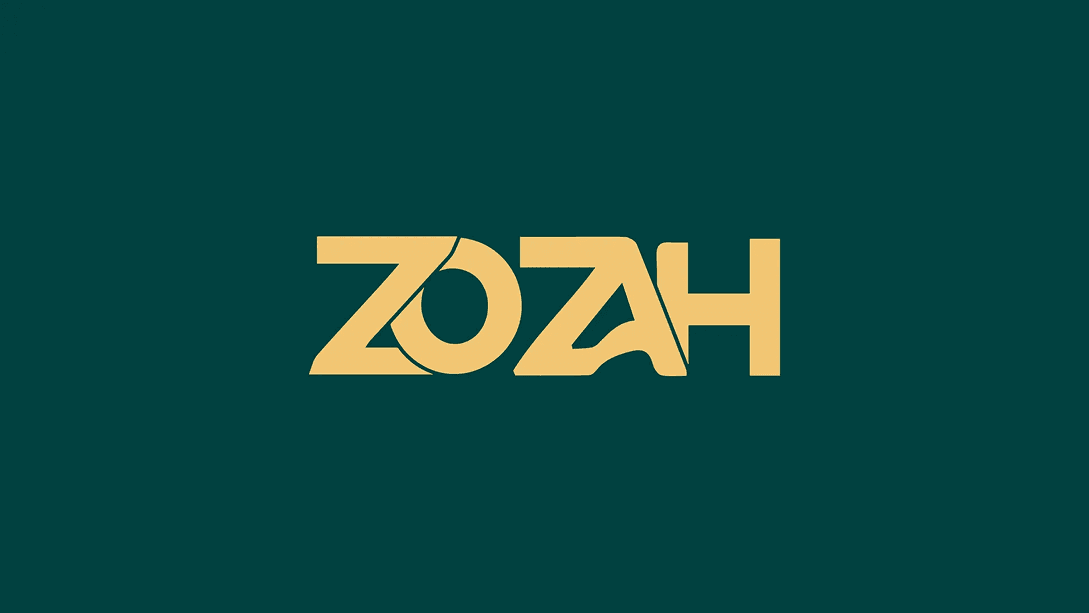
Logos & Branding - Zozah
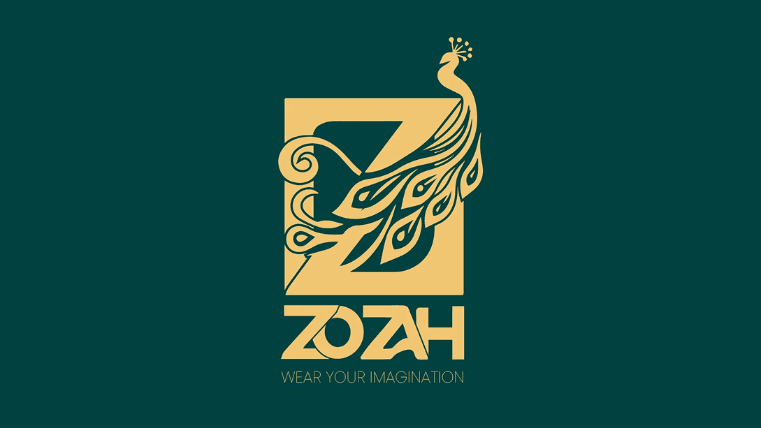
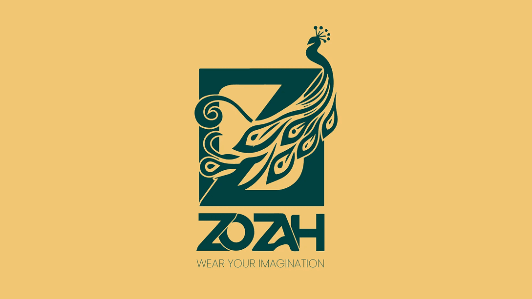
Wear Your Imagination. Embody Beauty.
Zozah is a Nigerian fashion and fashion accessories SME rooted in individuality, creativity, and expressive beauty. Derived from the Ebira word for “Beauty,” the brand positions itself as more than apparel, it is a wearable expression of imagination. The identity system was crafted to reflect luxury while remaining culturally grounded, blending symbolic storytelling with refined visual execution.

 Photoshop
 Illustrator
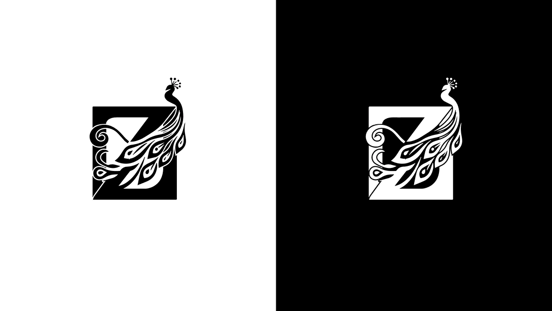
Business Context
Zozah entered the market as a new fashion SME looking to establish immediate credibility in a saturated and highly visual industry. The founder believed that a strong identity would not just differentiate the brand, it would signal quality, intention, and artistic depth from day one.
Brand Problems Identified
- How do we visually represent beauty without becoming generic?
- How do we express creativity without sacrificing luxury?
- How do we ground the brand in Nigerian heritage while appealing to modern fashion consumers?

Design Goals
- Develop a distinctive luxury identity that feels timeless.
- Visually communicate individuality and imagination.
- Incorporate cultural relevance without appearing folkloric.
- Create an adaptable system suitable for packaging, textiles, and editorial applications.
- Ensure the brand feels established, not experimental.

Discovery & Brand Strategy
Market & Industry Review
The Nigerian fashion landscape blends bold textile heritage with contemporary luxury aspirations. Many emerging brands rely heavily on typography alone or generic luxury cues (black, serif fonts, minimal marks). Zozah needed to rise above predictable luxury tropes.
Competitor Identity Audit
A review of fashion SMEs revealed: Heavy reliance on script fonts or high-fashion serif wordmarks, Limited symbolic storytelling, Minimal cultural integration. Zozah could own a symbolic, culturally nuanced luxury position.
Target Audience Insights
The Audience profile for this brand include: Fashion-forward individuals, Culturally aware but globally inspired, Value uniqueness over mass appeal, View fashion as self-expression.
Brand Positioning & Differentiation
Zozah positions itself at the intersection of Luxury × Cultural Beauty × Expressive Identity. It is not fast fashion. It is not trend-chasing. It is expressive elegance.
Logo Design & Identity System
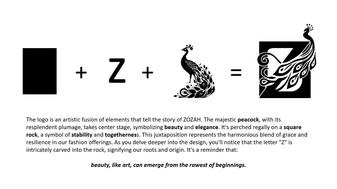
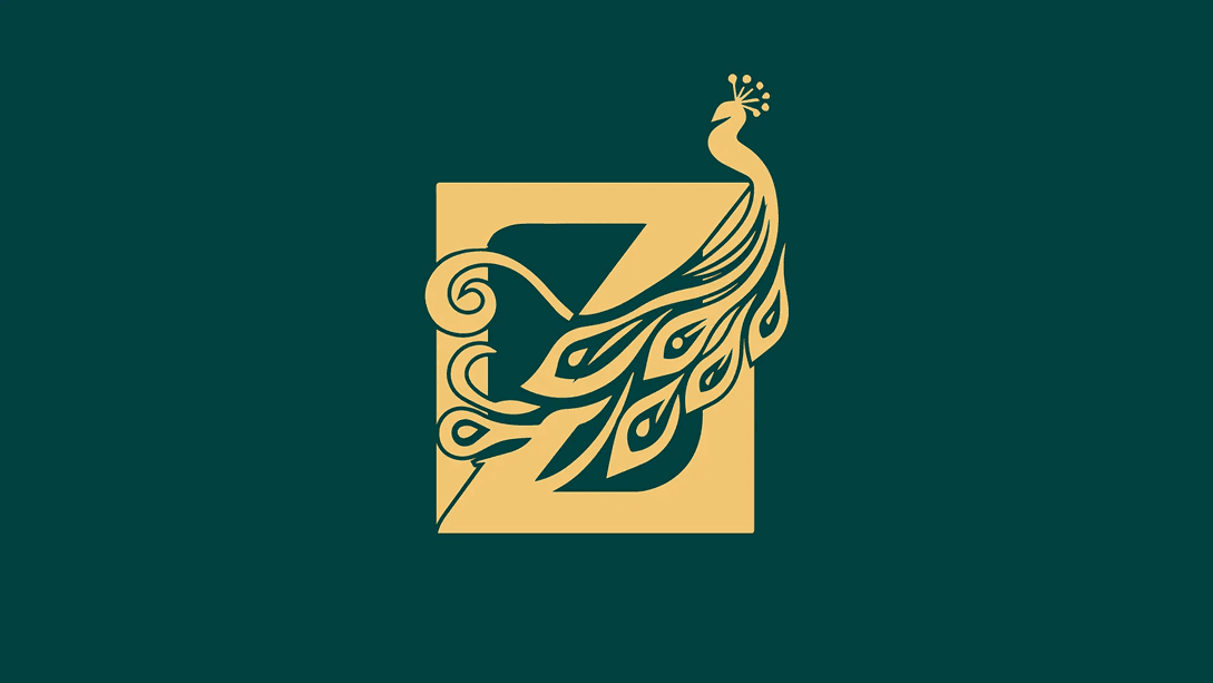
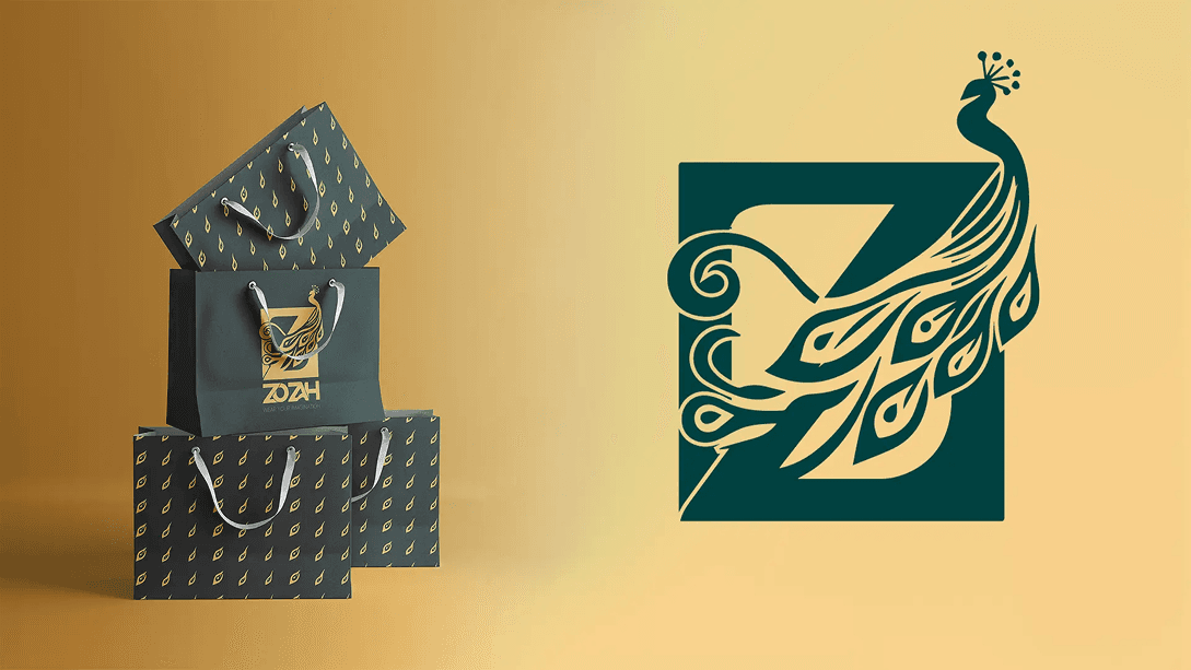
Every curve within the feather structure was intentionally balanced to maintain symmetry and harmony. The negative space subtly reinforces the “Z” form while maintaining visual elegance. The square enclosure creates contrast between fluid artistry and geometric control, symbolizing imagination within refinement.
- Peacock: beauty & expressive pride
- Letter “Z”: brand ownership
- Square: structure & luxury discipline
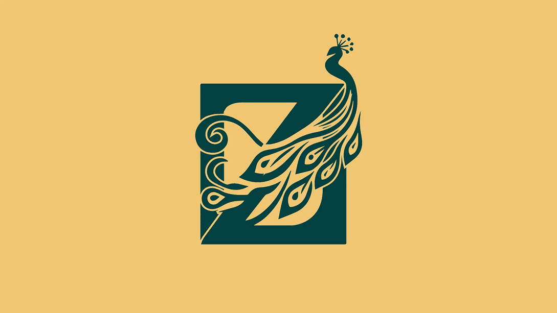
Logo Variations & Scalability
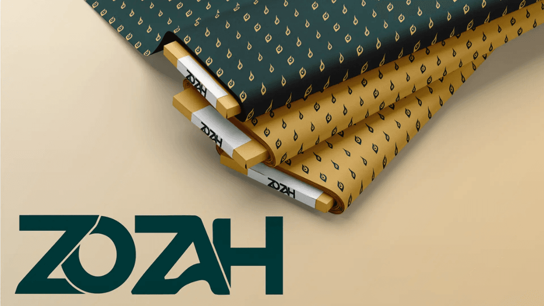
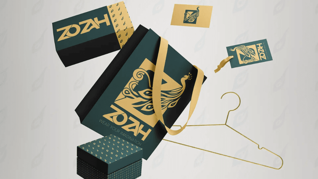
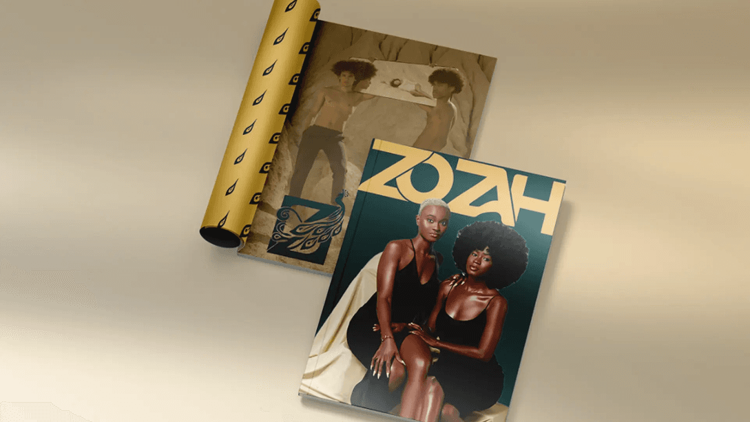
For scalability, the icon maintains clarity at small sizes. The square containment improves recognizability on tags and social avatars. The pattern system enables seamless textile and packaging integration. The variations and elements include:
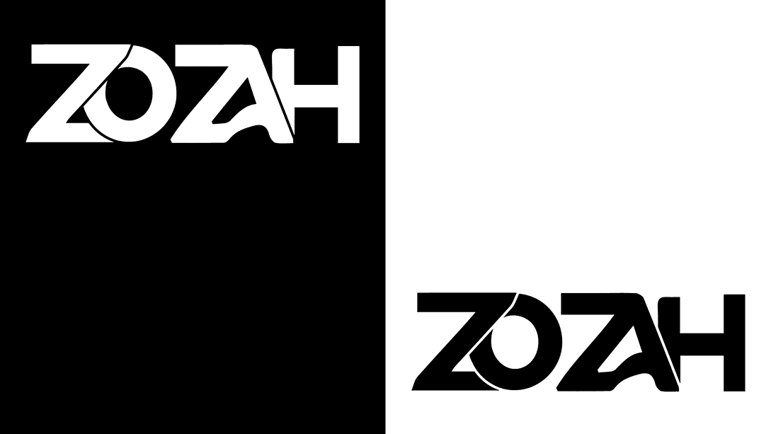
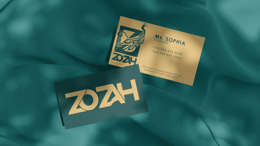
- Primary Lockup (Symbol + Wordmark)
- Icon Mark (Standalone emblem)
- Wordmark-only version
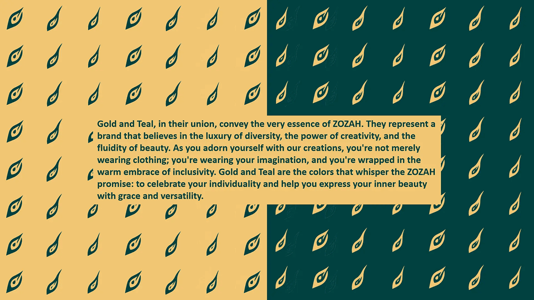
- Pattern extraction (feather repetition)
Brand in Use
The identity performs across Fabric printing, Packaging, Digital marketing, Editorial spreads etc. Through the use of Generous whitespace, Structured grid alignment & Controlled gold accents for emphasis, Luxury is communicated elegantly through restraint.
Final Outcome & Brand Impact
Final Brand Summary
Zozah emerges as a culturally grounded luxury fashion brand that celebrates expressive beauty through thoughtful design. The founder responded positively to the symbolic depth and premium aesthetic. Feedback centered around ensuring the brand felt “expensive but expressive.”
Alignment with Brand Goals
The final identity establishes immediate credibility, Differentiates from generic luxury competitors & Embeds storytelling into the visual system.
Readiness for Growth
The identity system supports: Product line expansion, Textile experimentation, Retail packaging as well as Digital storytelling.
Visual & Strategic Impact
The fusion mark creates memorability. The pattern system strengthens product packaging. The premium color strategy positions Zozah confidently in higher-value fashion spaces.
How the Identity Solves the Initial Problems
- Cultural nuance requires subtlety, not decoration.
- Luxury branding thrives on intentional restraint.
- Symbolic fusion creates stronger memorability than ornamental complexity.

What Worked Well
- Strong conceptual anchor (Beauty → Peacock → Z)
- Balanced emotional and structural design
- Pattern extension for real-world application

