Logos & Branding - Siblings Laundromat
A modern neighborhood laundromat built on trust, care, and clarity.
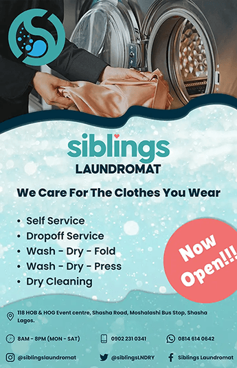
Siblings Laundromat is an SME laundry and dry-cleaning service based in Egbeda, Lagos, Nigeria. Following a full brand redesign in 2022, the business approached me to design promotional and in-store materials for their grand opening. The objective was to translate their clean, modern, minimalist brand direction into tangible marketing assets that would build trust and position them as the go-to laundry service in their local community.

 Figma
Figma Illustrator
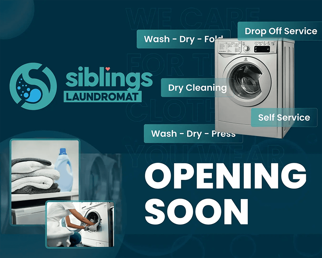
Business Context
Although Siblings Laundromat had completed a brand redesign earlier in 2022, they needed a cohesive visual rollout to support their grand opening. The opportunity wasn’t to reinvent the brand, it was to activate it. The challenge was execution: ensuring that every promotional and physical touchpoint reflected a clean, trustworthy, and modern service experience.
Brand Problems Identified
- Inconsistent application of the new brand direction
- Lack of launch-ready marketing materials
- Need to visually communicate professionalism in a competitive local market
- Limited time before opening date

Design Goals
- Translate the minimalist brand direction into impactful launch materials
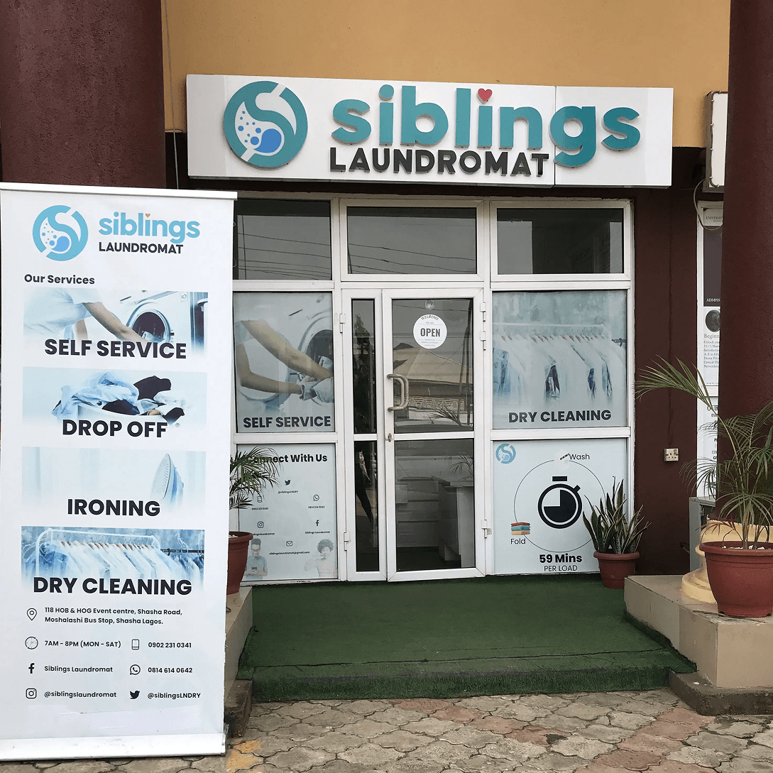
- Create high-visibility signage suited for Lagos street environments
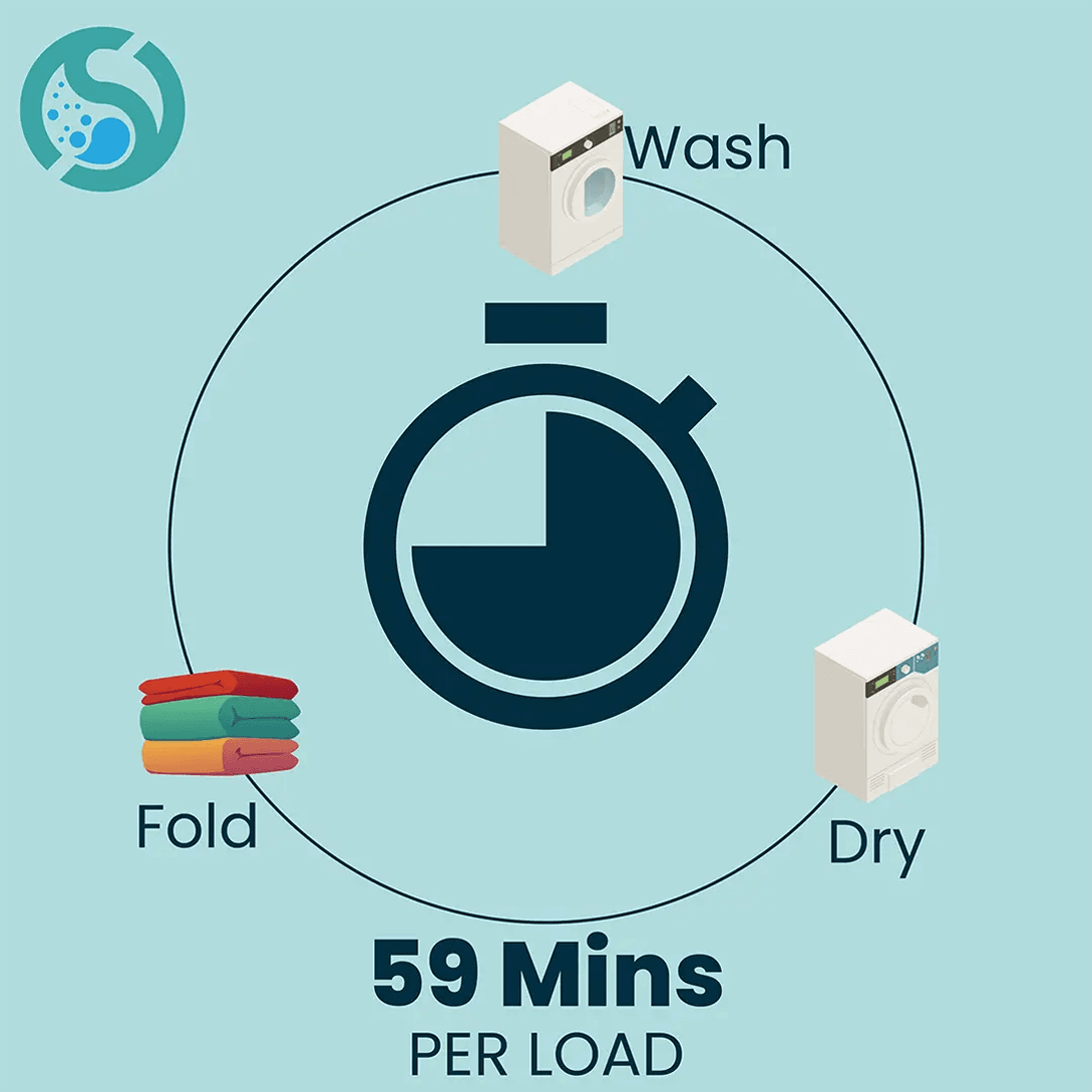
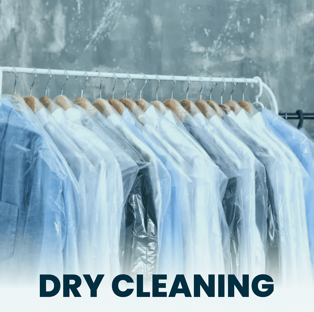
- Reinforce trust and garment care visually
- Maintain consistency across digital and physical touchpoints

Discovery & Brand Strategy
Market & Industry Review
Laundry services in Lagos often lean toward cluttered visuals, heavy color use, and inconsistent typography. Many rely on price-led messaging rather than brand trust. This presented an opportunity: differentiation through restraint.
Competitor Identity Audit
A visual review of local laundromats revealed: Overuse of literal washing machine graphics, Inconsistent brand systems, Poor typographic hierarchy, Limited emotional appeal. Most competitors communicated “affordable.” Very few communicated “professional care.”
Target Audience Insights
Primary customers included: Working professionals, Families, Students, Small business owners. Trust is paramount. In Lagos, word-of-mouth is powerful and visual credibility supports that.
Core Brand Attributes
Clean, Modern, Trustworthy, Caring, Professional
Brand Positioning & Differentiation
Siblings Laundromat is positioned as a modern, dependable laundry service that treats your garments with the same care you would. The differentiation strategy focused on:
- Controlled color usage
- Strong typography
- Visual restraint
- Clean, balanced compositions.

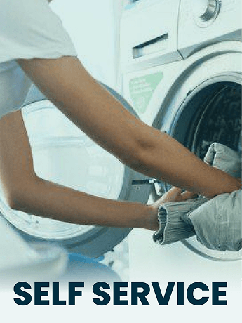
Visual Identity Application
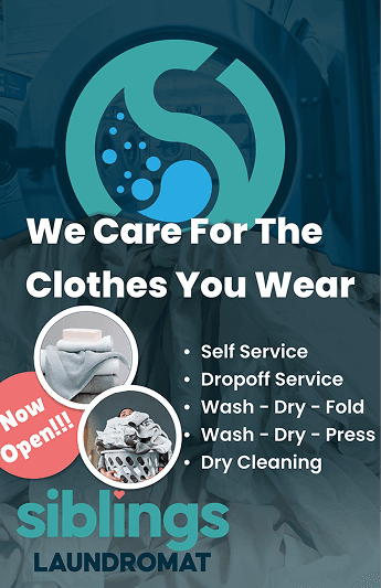
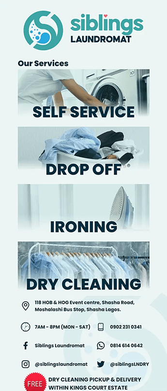
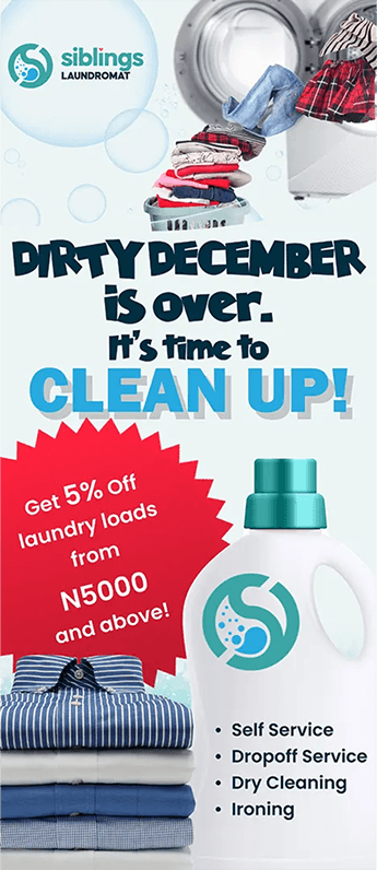
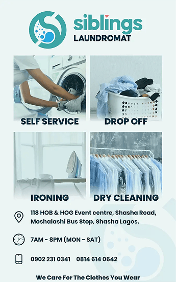
Designs were optimized for various print sizes, specified by the client; Large exterior banners, A4/A5 flyers, Window decals, Interior wall graphics. In order to create familiarity across formats, each collateral piece followed a consistent hierarchy:
- Primary Message
- Service Offering
- Supporting Visual
- Contact/Location Details


Real-World Adaptability
Color blocking, typography hierarchy, and spacing rules remained consistent across all pieces. This ensured that whether someone saw a flyer or passed the storefront, the experience felt unified. The bold typographic scale ensured maximum impact and outdoor banners were tested for Legibility at moving speeds, Contrast under bright daylight and Viewing from different angles.
Outcome & Brand Impact
Final Brand Summary
Siblings Laundromat launched with a professional, confident brand presence that visually differentiated it within the Egbeda market.
Business Needs Met
The Designs provided immediate brand credibility, Supported strong grand opening awareness & Established visual consistency from day one.
Visual Impact
The minimalist yet bold approach helped the brand feel structured and reliable, critical for a service handling personal garments.
Readiness for Growth
The established collateral system can extend into Seasonal promotions, Loyalty campaigns, Digital social campaigns & Additional branch signage.
Key Design Learnings
- Activation design is as strategic as identity creation
- Environmental context should influence scale decisions
- Simplicity can outperform clutter in competitive local markets

What Worked Well
- Clear typographic hierarchy
- Strong contrast system
- Strategic restraint