Logos & Branding - Chopam
A joyful food brand that celebrates Nigerian flavor with bold personality.
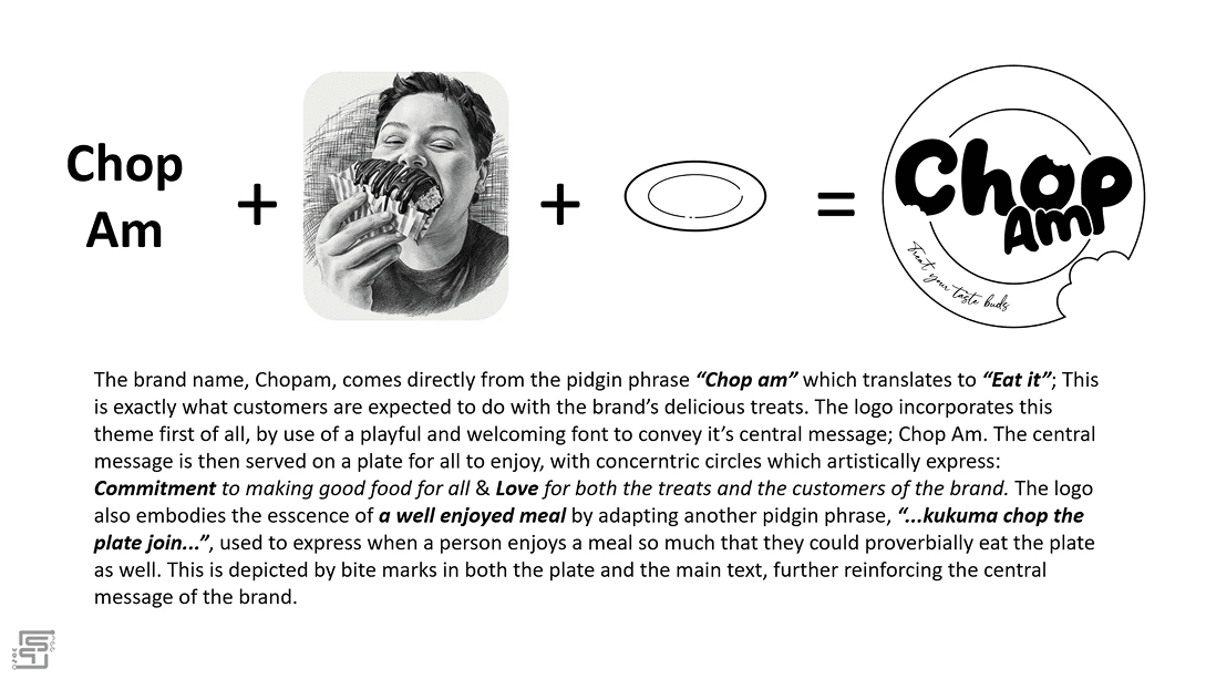
ChopAm is a Nigerian ghost kitchen and catering brand reintroduced to the market with a renewed identity rooted in vibrancy, flavor, and cultural expression. Built around the Nigerian pidgin phrase “Chop am” (meaning “eat it”), the brand was designed to embody the joy, warmth, and diversity of Nigerian cuisine while standing out in a saturated food delivery landscape. This rebrand marked a fresh market re-entry after a multi-year hiatus, requiring not just a new logo, but a renewed personality, voice, and visual system that could scale across packaging, events, and digital channels.

 Photoshop
 Illustrator
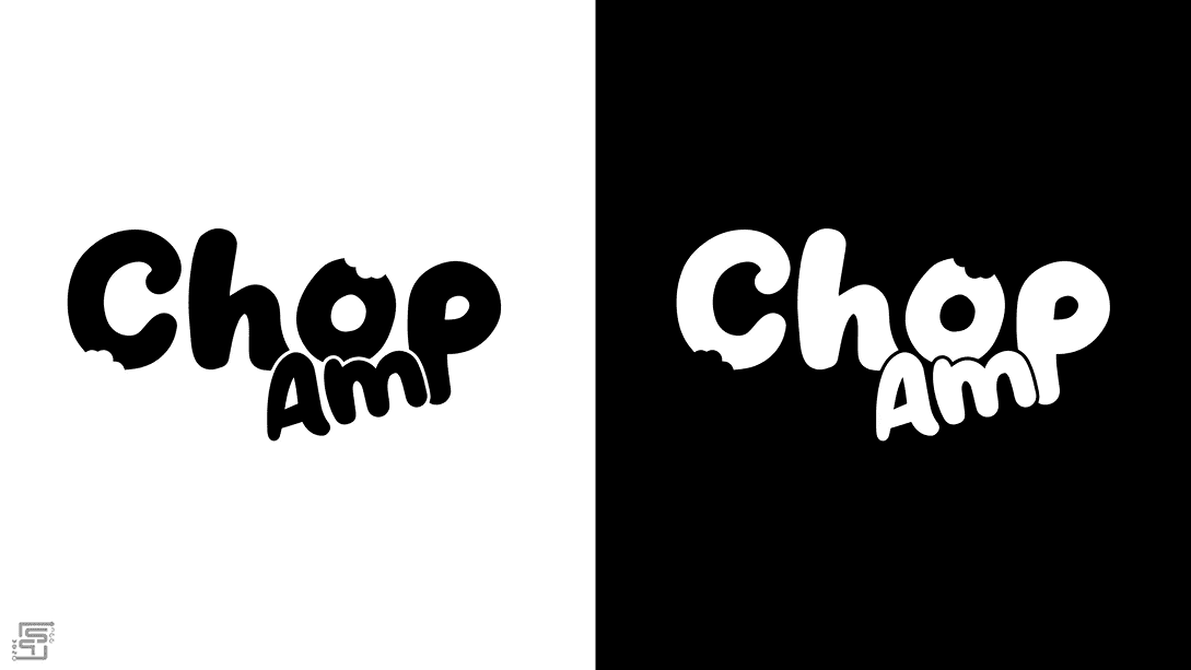
Business Context
The business previously operated under a different name before going on hiatus. Upon relaunch, the owner wanted a complete reset; new name, new direction, new energy. The goal was to re-enter the market boldly and memorably.
Brand Problems Identified
- Previous identity lacked personality and memorability
- No strong cultural anchoring
- Visual identity did not reflect the vibrancy of Nigerian cuisine
- Weak emotional connection with customers
- The owner explicitly requested that the new identity should not reference the former brand in any way, including name structure.

Design Goals
- Capture the joy and diversity of Nigerian cuisine visually
- Create a fun, playful yet professional identity
- Develop a memorable wordmark system
- Ensure adaptability across packaging and catering materials
- Build an identity that feels culturally authentic without being cliché

Discovery & Brand Strategy
Market & Industry Review
The Nigerian ghost kitchen space is highly competitive, often dominated by: Script-heavy logos, Generic food icons (chef hats, spoons, flames), Overused red/black palettes. Many brands leaned heavily into “home-cooked” aesthetics but lacked strong system thinking.
Competitor Identity Audit
Common observations include: Limited originality in typography, Heavy reliance on stock iconography, Weak emotional differentiation. This opened an opportunity to lean into culture-first branding and expressive typography.
Target Audience Insights
Primary customers are Young urban professionals ordering delivery, Event organizers and families hosting gatherings, Social media-savvy food lovers. They value Flavor, Presentation, Cultural pride, Memorable experiences Food, in this context, is not just sustenance, it is celebration.
Brand Positioning & Differentiation
ChopAm positions itself as: “The joyful, unapologetically Nigerian food brand that turns every meal into an experience.” Rather than focusing solely on taste, the brand emphasizes emotion and enjoyment.
Logo Design & Identity System
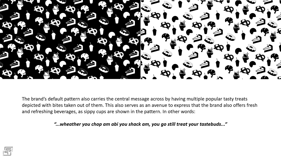
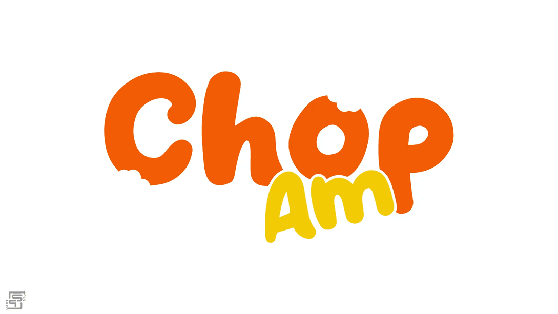
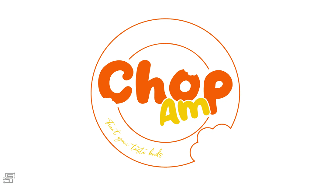
The wordmark is fully custom-built, with rounded, flowing letterforms inspired by the softness and curves of baked goods and plated cuisine. Bite marks carved from select letters visually echo the phrase “Chop am.” The alternate plate icon reinforces the playful phrase: “kukuma chop the plate join.”
- Rounded forms: warmth & approachability
- Bite details: literal interpretation of brand name
- Handwritten tagline: human touch
- Sauce-inspired script: culinary sophistication
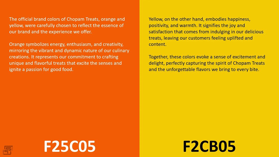
- #F25C05 (Vibrant Orange): Appetite stimulation, Energy, Warmth
- #F2CB05 (Rich Yellow): Joy, Optimism, Cultural vibrancy
Logo Variations & Scalability
Each logo variation maintains recognizability across contexts, from the primary horizontal wordmark, to the plated logo with bite marks. In terms of scalability, Simplified bite cuts maintain clarity at small sizes, Balanced stroke weights help with future packaging print and the icon form is well optimized for social avatars.


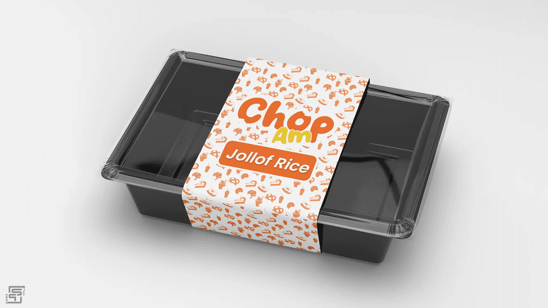
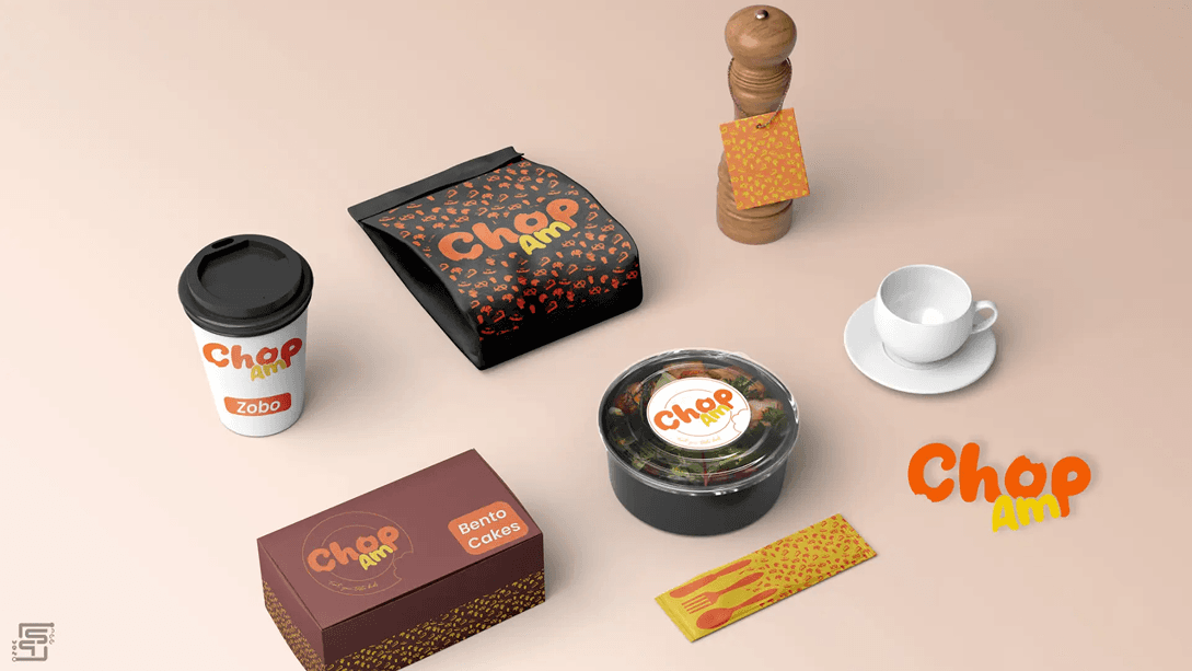
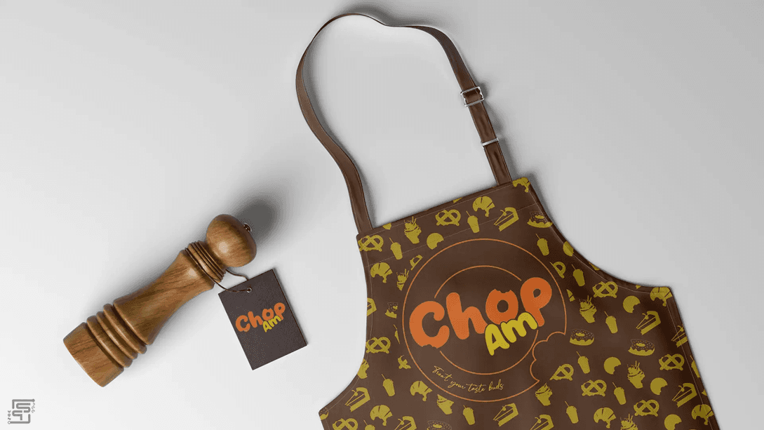
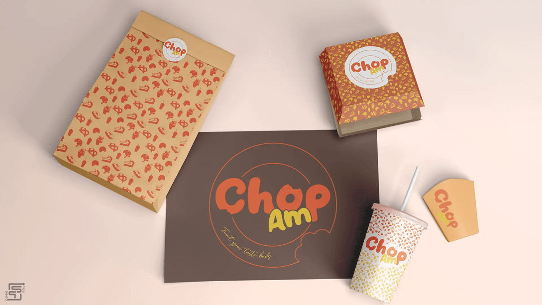
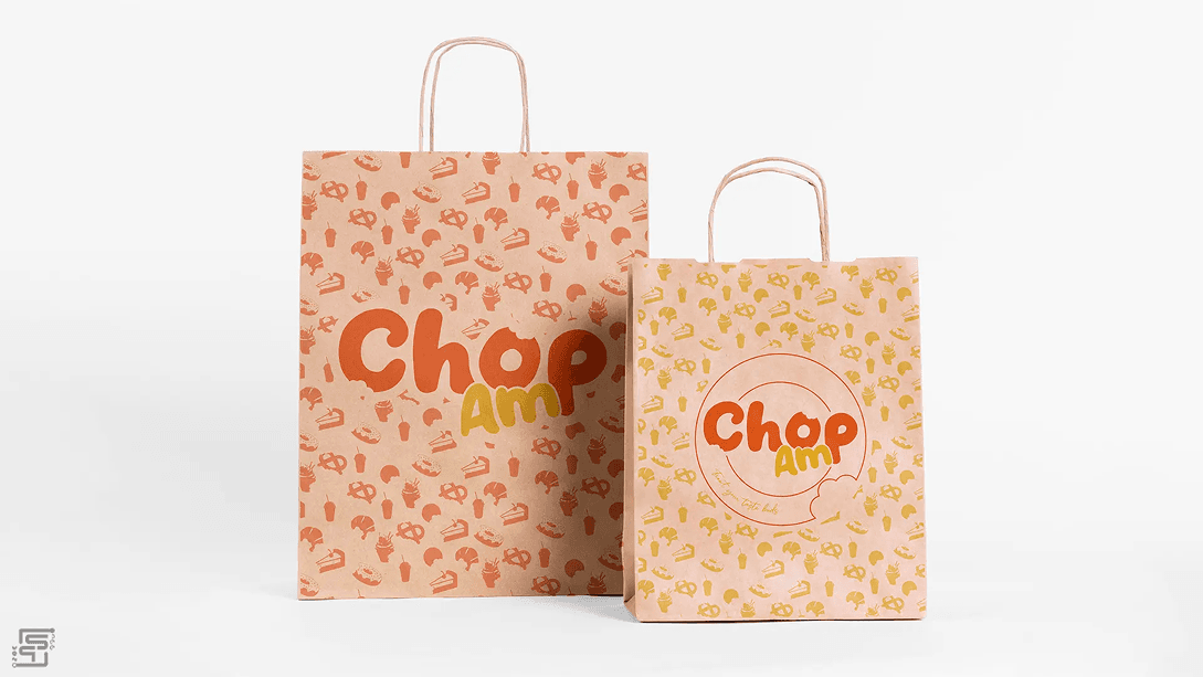
Brand in Use
The vibrant palette and expressive type ensure immediate brand recall whether on delivery packaging or event banners. Here are some use cases across Food packaging, Takeout boxes, Cooking utensils mockups, Catering materials.
Final Outcome & Brand Impact
Final Brand Summary
ChopAm successfully re-entered the market with a confident, culturally rooted identity that feels joyful and unmistakably Nigerian.
Alignment with Brand Goals
The final identity achieved Cultural authenticity, Market differentiation and Emotional resonance.
Client response
“You understood the assignment.”
Visual & Strategic Impact
The brand now Commands attention on packaging, Feels modern yet culturally grounded and Scales confidently for catering growth.
How the Identity Solves the Initial Problems
- Replaced generic visuals with expressive typography
- Built a distinct personality
- Strengthened emotional connection

What Worked Well
- Bite motif integration
- Sauce-inspired tagline styling
- Vibrant yet cohesive palette